
{{text}}
Share
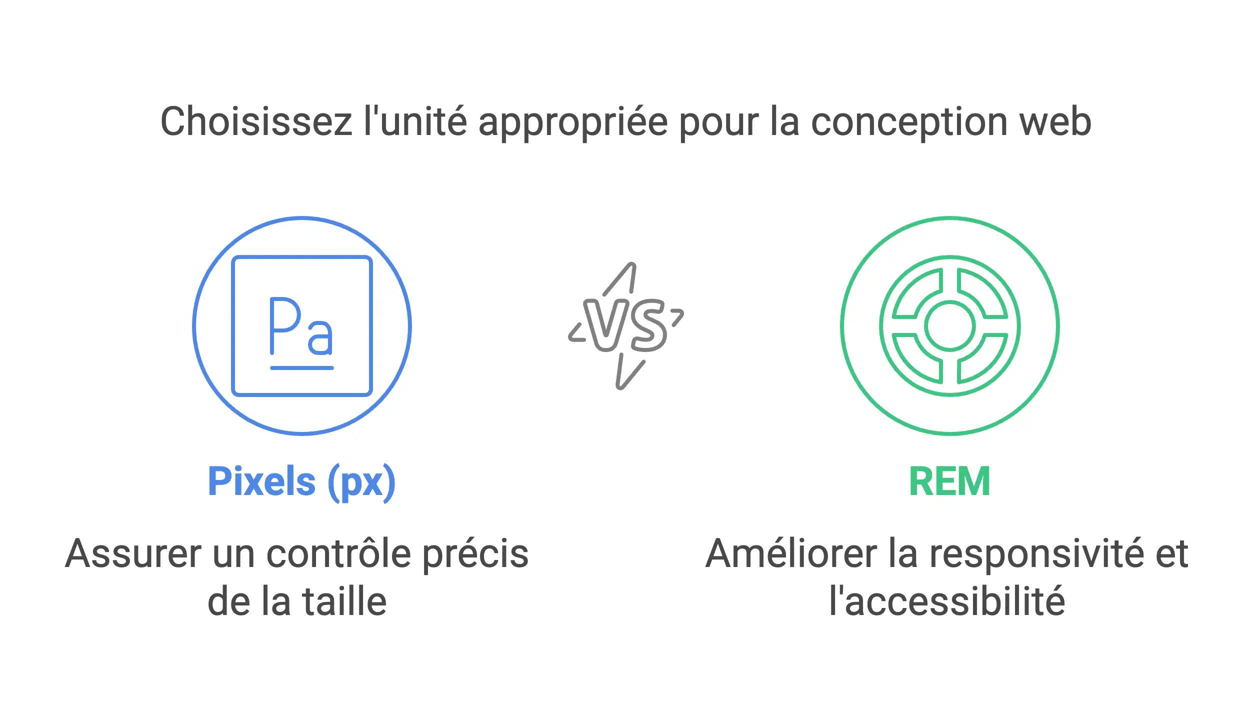
REM VS PX, In web development, the choice between REM (Root EM) and PX (Pixel) is a debate that divides front-end developers. Should we focus on the precision of fixed pixels or the adaptability of relative units ?
Choosing between pixel (px) and `rem` units of measurement is vital for creating a website that offers a quality user experience. This decision influences the accessibility and responsiveness of your site, which are important aspects in web development. The pixel and the `rem` have their specificities and optimal uses, especially in platforms like Webflow.
Understanding the difference between these two units and knowing when to use each can greatly impact the performance of your site.
Whether you are a novice or an expert in web development, our webflow agency in Paris offers you a px vs `rem` comparison that will provide you with the keys to choose wisely and improve your web project.
What is the pixel (px)?
Definition of PX
The pixel (px) is an absolute unit of measurement used in CSS and HTML to define the size of elements on a website. It differs from relative units like `rem` because it is directly related to screen resolution and size.
This means that the size set in pixels remains constant regardless of browser settings or the default font size.
Pixels are particularly useful for fine-grained control over the size of items, such as displaying images or graphics with specific dimensions.
Benefits of the PX vs REM unit
The absolute precision of the pixels allows specific control over the size of certain web elements, essential for the precise layout of icons, buttons, or graphic elements.
Pixels are also easier for beginning developers to understand and use, thanks to their direct relationship to screen resolution, making size calculations more intuitive.
Disadvantages of the PX vs REM unit
Despite their precision, pixels can pose problems with responsiveness and accessibility, as they do not automatically adapt to different screen sizes or font preferences of users. This can compromise readability and display on a variety of devices.
The exclusive use of pixels can also affect the user experience and accessibility for those who adjust their browser's default font size, since the elements won't adapt to these changes.
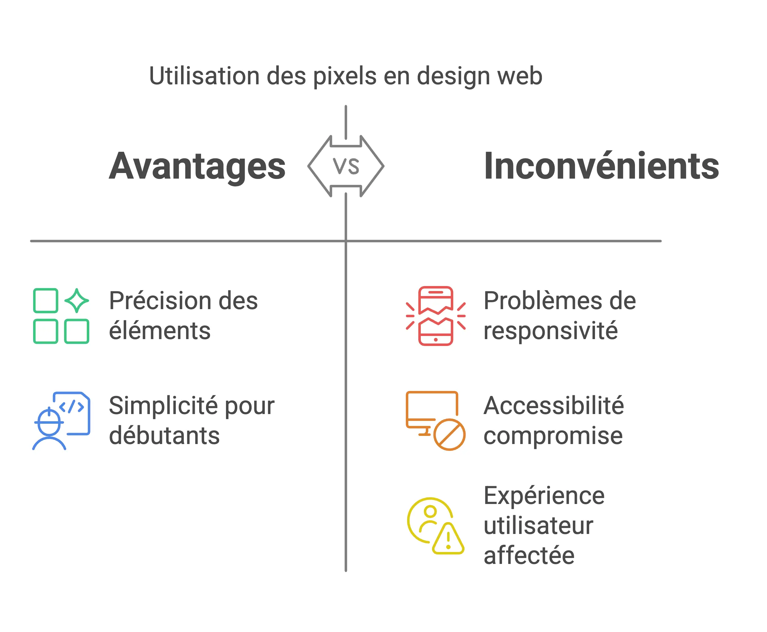
PX pros and cons table
What is rem (root em)?
Definition of REM
The Rem, for “root em”, is a unit of measurement in CSS that is relative, unlike pixels, which are absolute. This unit is based on the font size of the root element of the document, which is usually set to the element html. Thus, the dimension of an element in Rem depends on the font size of the root element. If this size is 16 pixels, then 1rem corresponds to 16 pixels, 2rem to 32 pixels, and so on. This approach makes it possible to adjust the size of the elements uniformly according to the base font size.
Advantages of the REM vs PX unit
One of the major advantages of Rem is their flexibility and their ability to adapt to user font size preferences. Use Rem means that the elements on your website will automatically adjust according to the default font size of the user's browser, greatly improving accessibility and the user experience, especially for those who change this size for accessibility reasons.
Les Rem are also perfect for responsive design. They make it easy to adapt elements to various screen sizes without the need for multiple media queries. This makes developing websites that perform well on all devices, from smartphones to desktops, much easier.
Disadvantages of the REM vs PX unit
Although the Rem offer great flexibility, they can be complex for novice developers. Understand the relationship between Rem and the font size of the root element may require additional adaptation time and calculations, especially when converting pixel values to Rem.
In addition, the Rem are not directly related to the width or height of the screen, but only to the font size of the root element. This means that while they are useful for adjusting typography and spacing, they alone do not address the responsiveness challenges associated with screen dimensions. Other techniques are still necessary to ensure an adequate adaptation of your site to different screen sizes.

Advantages and disadvantages table REM vs PX
REM vs PX: a comparison
Accessibility
The major difference between the units px and Rem is due to their impact on accessibility. Les Rem are significantly more accessible, especially for users with visual disabilities.
Les Rem, based on the font size of the root element, allow users to adjust the font size in their browser settings. This greatly improves readability and the user experience.
Conversely, the units px are fixed and don't take into account users' font preferences, often forcing them to zoom in to read content. This can complicate navigation and general use of the website.
Responsive design
Responsive design illustrates another field where px and Rem divergent. Les Rem facilitate the creation of flexible and responsive designs. Linked to the font size of the root element, changes in this size affect all elements by Rem, allowing smooth adaptation to various screen sizes and resolutions.
The units px, on the other hand, don't automatically adjust to changes in screen size or resolution, making them less practical for responsive designs that require flexibility and adaptability. However, the px can be useful for elements that require a fixed and precise dimension, such as icons or graphics.
Practical cases
The choice between px and Rem often depends on the element to be stylized. For typography and spacing, the Rem are generally preferable.
They ensure uniform scalability and enhance accessibility, which is essential for websites aimed at a large audience, including those with visual disabilities.
For graphic elements or components that require absolute precision, such as icons, buttons, or images, the px are often better suited. These elements require exact dimensions to maintain their aesthetics and functionality, and px offer that precise level of control.
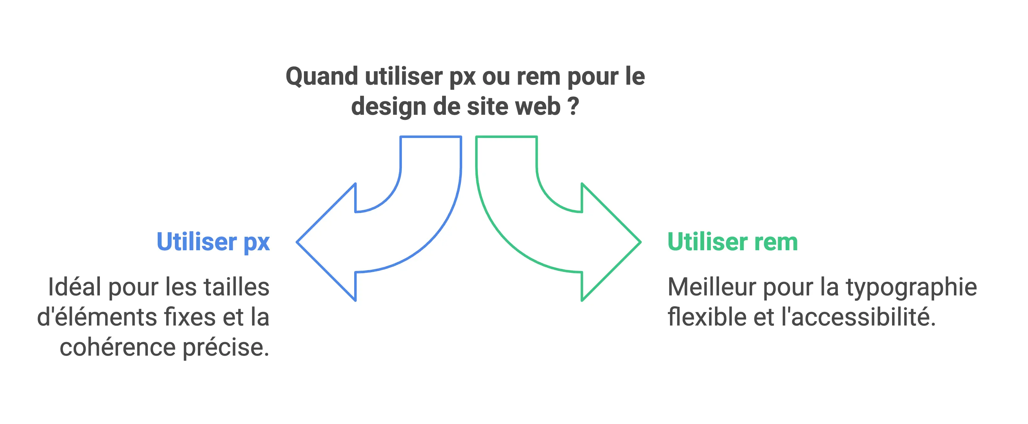
When should you choose Rem vs PX for your website?
Scenarios for px on your site
Pixels (`px`) are perfect for ensuring perfect precision in the size of the elements on your website. They are particularly useful in the following cases:
Graphics and icons: For icons, images, and other graphics that require precise dimensions, pixels provide the control needed to ensure consistency in size and proportions across screens.
Fixed borders and spacings: Pixels are ideal for defining borders, margins, or paddings with exact values, maintaining consistency in layout and avoiding variations due to changes in font size or resolution.
Fixed-size components: For buttons, forms, or any other component that requires a specific and constant size, choosing pixels ensures visual and functional consistency across platforms.
Scenarios for rem on your site
The `rem` units are ideal for situations that require flexibility and adaptability. They are preferred in the following contexts:
Typography and responsive layout: `rem` offer an automatic and fluid adaptation of the typography and spacing according to the font size of the root element, improving the accessibility and responsiveness of the site, especially for users changing the font size of their browser.
Accessible website design: By respecting user preferences for font size, `rem` play an important role in accessibility, ensuring that content is legible on all devices and configurations for people with visual disabilities.
Global and coherent design: Using `rem` to define sizes allows you to maintain consistency in your design. A change in the font size of the root element affects all elements in `rem`, simplifying the management and maintenance of the site.
Combination of the two units of measurement
Combining `px` and `rem` can be beneficial to take advantage of the benefits of each unit. Here's how to marry them effectively:
Use of px for fixed elements and rem for typography: Pixels are suitable for elements that require precise dimensions, such as icons or borders, while `rem` are adapted to the typography and spacings that should adjust to the font size of the root element.
Setting a base font size in rem and using px for fine adjustments: Setting a base font size in `rem` provides global adaptation, and using pixels for fine adjustments ensures precision where needed.
Use of CSS preprocessors to facilitate conversions: CSS preprocessors, such as SCSS or LESS, can simplify the conversion between `px` and `rem`, allowing for more flexible and efficient management of your styles.
Convert PX to REM easily
Conversion formula
Turning pixels (`px`) into `rem` is easy once you enter the essential formula. The key is knowing the base font size, which is often expressed in pixels.
By default, this base font size (`html`) is usually set to 16 pixels, although this may change depending on the design you want.
Here's how the conversion formula works: rem =\ (\ frac {px} {base font size}\). For example, to convert 32 pixels to `rem` with a base font size of 16 pixels, the calculation would be: rem =\ (\ frac {32} {16}\) = 2 rem. So 32 pixels correspond to 2 `rem` when the base font size is 16 pixels.
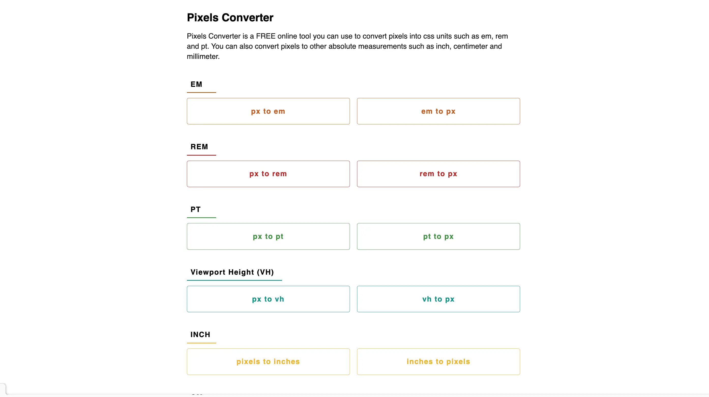
Online tools: Rem vs PX
To facilitate the conversion and minimize errors, there are numerous online tools at your disposal. They allow pixels to be efficiently converted to `rem` and vice versa.
Platforms like CodeBeautify, Pixels Converter, and LambdaTest offer `px` to `rem` converters that are easy to use. Simply enter the value in pixels and, if necessary, adjust the base font size to different from 16 pixels.
These tools instantly provide the equivalent in `rem`. For example, with the LambdaTest converter, you insert the value in pixels, adjust the base font size if needed, and click “Convert” to see the value in `rem`. These resources are extremely useful for optimizing your workflow and ensuring accurate and consistent conversions.
CSS best practices
Define a base size
Setting a base size for fonts and other elements is essential to ensure consistency and ease of scaling your design. A recommended method is to set the font size of the root element (html) to simplify future calculations and adjustments.
For example, setting the root element font size to 62.5% of the default size (16 pixels) makes conversions to `rem` simpler and calculations more intuitive. Here's how you can set this base size in your CSS:
html {font-size: 62.5%;}
This configuration makes `1rem` equivalent to 10 pixels, making conversions and size adjustments much easier.
Test the units used
Testing the units of measurement used is essential to ensure that your website is displayed correctly on different devices and browsers. Here are some best practices for testing your units of measurement:
Use developer tools built into browsers, like Chrome DevTools or Firefox. These tools allow you to test and adjust styles in real time, helping you understand how different units impact the layout and appearance of your website on various screens and resolutions.
Test your website on a variety of devices, including desktops, tablets, and smartphones. This helps you confirm that the units of measurement selected work properly in a variety of contexts and screen resolutions.
Use media queries to create responsive designs. Media queries allow you to adjust styles according to the width and height of the browser window, ensuring that your website adapts properly to different screen sizes.
Summary: When should I use px and rem together?
- Typography and spacing: Promote them
Remfor a global and accessible adaptation. - Precise graphic elements: Use the
pxfor components that require fixed dimensions. - Smart combination:
- Base the overall sizes (font-size, paddings) by
Rem. - Specify details (icons, borders) by
pxto maintain total control.
- Base the overall sizes (font-size, paddings) by
By combining these units wisely, you will get a flexible, accessible and aesthetically accurate design for your Webflow project.
Conclusion: REM vs PX
In conclusion, choosing between `px` and `rem` units is based on your design goals and the experience you want to offer users. The `px` ensure perfect precision, perfect for graphic elements and components that require exact measurements. Conversely, `rem` promote better scalability and accessibility, which is essential for typography and responsive designs.
For in-depth expertise on your Webflow project, the agency Synqro is positioned at the top of Webflow agencies in France. With its 3 certifications in Webflow creation and its low-code approach, Synqro is able to meet all your requests for creating or redesigning a Webflow site. Whether for design, development, SEO or maintenance, Synqro offers an all-in-one solution to realize your vision into an effective and captivating digital presence.
Contact Synqro to discuss your project and enjoy a seamless user experience, designed to effectively convert your visitors into customers.
FAQ: REM vs PX
What is an absolute unit like px?
The px (pixel) is a fixed unit that does not change based on user preferences or screen size. It guarantees constant dimensions.
Why is rem a relative unit?
The Rem (root em) is based on the font size of the root element (html). This approach allows elements to automatically adjust when the base font size changes.
Is REM better for accessibility?
Yes, because the elements in rem adapt to user preferences, such as increasing the font size in the browser, which improves the readability.
When are PXs best?
Les px are recommended for graphic elements that require exact precision, such as icons, borders, or images.
Is rem suitable for responsive designs?
Absolutely. The rem makes it easy to adapt element sizes to different screens by simply changing the root font size.
Is combining px and rem a good idea?
Yes, it allows you to take advantage of advantages of both units : Use px for fixed elements and rem for typography and adaptive spacing.
What are the main disadvantages of the PX?
Les Px don't adapt user preferences or different screen sizes, which may affect the responsiveness and accessibility of the site.
What are the disadvantages of rem?
The rem may be intricate for beginners, as it requires an understanding of relationships with basic font size.
Is the rem compatible with all browsers?
Yes, rems are supported by all modern browsers, making it a reliable option.
Why define a consistent base size?
A consistent base size ensures a uniformity in the design and facilitates adjustments for the entire site.
Should we always prefer rem for typography?
Yes, because it allows for uniform scaling and renders text more accessible, especially for users with specific needs.
What elements should always be in px?
Icons, borders, images, or anything else that requires a fixed dimension should be defined in px.
Can the rem completely replace the PX?
No, rem is great for typography and spacing, but Px remain essential for fixed graphic elements.
How do you ensure an optimal user experience?
By combining the rem for a maximum flexibility and the px for precise dimensions, you will get an accessible and well-structured design.
Synqro's latest achievement